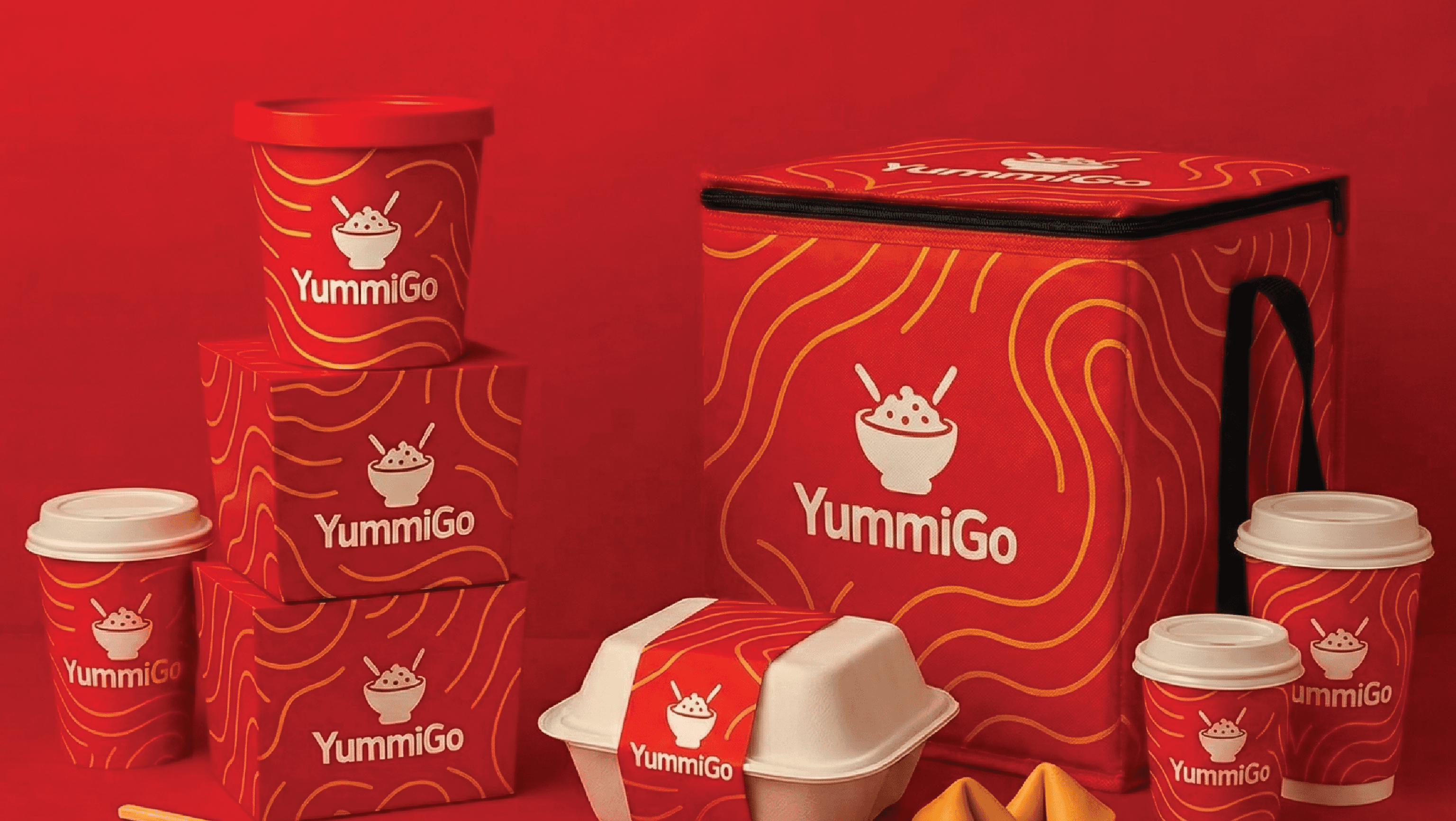
Fresh Fork is an organic restaurant located in the heart of the city center, surrounded by a wide variety of fast food joints, cafes, and multi-cuisine restaurants — from Italian and Chinese to local Indian flavors. The client wanted to make Fresh Fork stand out as a purely organic and health-first alternative, so we knew from the beginning that the brand identity had to instantly communicate freshness and nature.
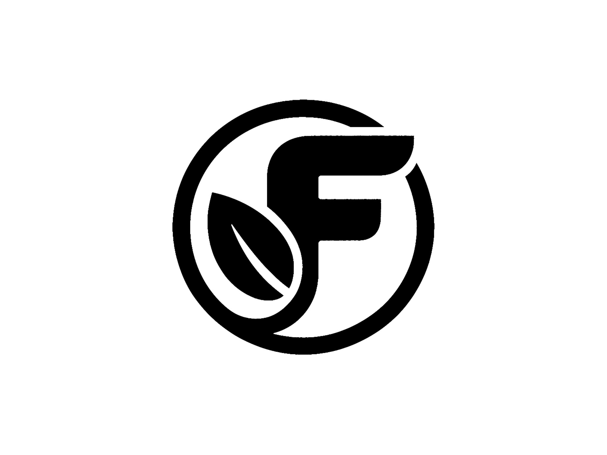
To achieve this, we crafted a logo that features a bold "F" combined with a leaf — a clean and recognizable mark that visually conveys the brand’s core values at first glance.
The main challenge was to create a logo that feels minimal, modern, and organic — without overcomplicating it. The balance between the letterform and the leaf had to feel natural, not forced. The circular enclosure adds to the wholesome feel while also making the logo compact and scalable across signage, packaging, and digital use.